This is the first of my 'weekly WASH graphs', exploring the relation between the wealth of a country over time, and its level of access to at least basic water services.
Published on: 17/05/2018
One of my favourites is the daily chart on the Economist's webpage. It is a graph, a chart, an infographic or a table that explains a current topic, accompanied by a short explanatory text. They always have an interesting and fun take on data that is otherwise quite boring, or that nicely summarizes lots of complex data (such as this interesting graph on collusion between countries at the Eurovision song contest).
I thought it would be fun to do something similar for the WASH sector. So, I intend to post regularly (definitely not daily though) some graphs that I am working on, a number or table that I have come across, or just a fun fact, to illustrate some of the trends and issues in the sector. Some of these will be quite (water)nerdy – but I hope to make them interesting for all. And I invite others to share theirs as well, so we create a nice flow of weekly WASH graphs.
So, here is my graph to kick this off.
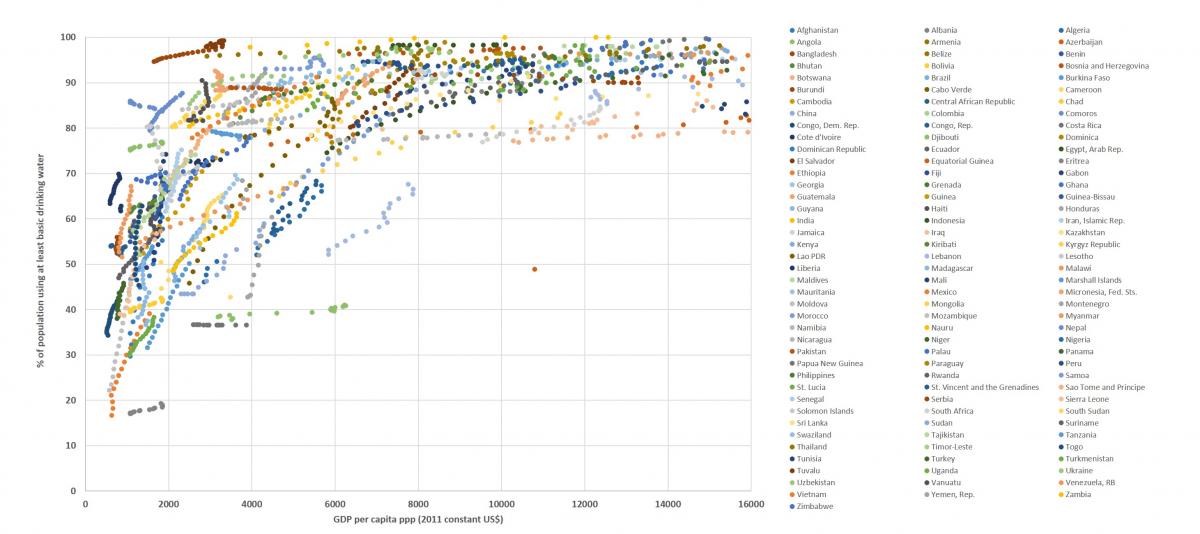
This colourful monster is my attempt at showing the curve that describes the relationship between the wealth of a country and its level of access to water services. The x-axis has the per capita GDP of a country (in ppp in 2011 US$); the y-axis the percentage of the population with access to at least basic services (so including safely managed), as per the recent JMP data. Each coloured trail is the trajectory of a country over the period from 2000-2015. I have mapped this for almost all countries on the OECD-DAC list, so all least developed countries, as well as lower and upper middle income countries.
You can see a broad asymptotic curve, showing that as per capita GDP increases, also the level of access increases, levelling off eventually towards universal coverage. This is visible at the level of the trajectory of every country. Jointly, these form the macro curve. The curve tells us a couple of things (please feel free to download the Excel sheet below to explore the data in more detail):
Could one extrapolate these data to the next 15 years? Nobody can predict economic growth, and the data also shows that the relation between GDP growth and access growth is not linear. But one could have a little try. Pick a country, look at the line it makes now, and double the length of that line. That would be the GDP and access level in 15 years from now, if over those 15 years both average GDP growth and access growth remain the same.
If you do that, for most countries in the lower GDP ranges, the 100% mark would be far away. That chimes with other linear projection data, such as on WASHwatch. That means, that if we want to reach the SDGs, we need to beat the curve. I hope that these data can give you some insight into whether and to what extent that would be possible.
At IRC we have strong opinions and we value honest and frank discussion, so you won't be surprised to hear that not all the opinions on this site represent our official policy.